A new identity
At DreamingFish, we know that the smallest visual details can have a big impact. A single frame, a colour grade or a font choice can completely change how a story feels. So when Instagram unveiled its first logo update in a decade, we couldn’t help but take notice…
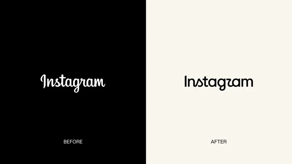
Last week, Instagram unveiled a refreshed wordmark; its first major update in 10 years. Don’t worry, the iconic camera icon isn’t going anywhere. It’s the typeface spelling out “Instagram” that’s had the makeover. Adam Mosseri, Instagram head, announced the update on 13 August, describing the new lettering as “sharper and more modern, while still nodding to the brand’s original handwritten character.”
So, why the change?
Well, after ten years, Instagram decided its visual identity was ready for a bit of a refresh. And it’s not just a new wordmark either. The refresh is part of a much wider brand refresh, with new typefaces and refinements to Instagram’s wider visual identity, all designed to better reflect creativity, individuality and self-expression.
“The refreshed brand system puts our community’s creativity and self-expression front and centre. It’s designed to spark courageous action and give people the confidence to create and show up for themselves freely and fully.”
May Hartono, Director of Brand Design at Meta
The internet’s reaction
Naturally, within hours of the new update, social media was flooded with opinions on the new logo. The nickname “Instagzam” started trending, with users saying the new stylised “r” reads more like a “z” or even a “u.” Others have criticised the redesign for being difficult to read, questioning why Instagram would change something that was already so recognisable. In addition, some even pointed out that Instagram might be better off fixing bigger issues like AI content moderation or account recovery, instead of tweaking a font.
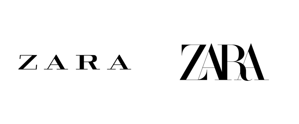
Not every reaction has been negative, though. Plenty of people have praised the new design for its cleaner and more contemporary feel. And this kind of divided reaction isn’t unusual – in fact, it’s one of the things that makes branding so interesting. Love it or hate it, it’s clear that the update has people talking. There’s no such thing as bad publicity right? And Instagram isn’t the first brand to discover that changing something familiar can cause a stir…Remember the Zara rebrand? 👀
What can we learn from this rebrand?
A logo isn’t just a pretty graphic. It’s one small part of a much bigger visual identity. Instagram’s update is a great example of just how much emotional attachment people can have to a brand. Its original wordmark has been seen by millions of people over the past decade; it’s familiar. So, even a relatively subtle change can feel huge. And that’s something we see in video production too. Whether we’re creating a brand film, product video or animated explainer, design plays a huge role in how the final video feels. Typography, colour, composition and transitions all work together to communicate a brand.
So, what can we learn from this rebrand? A refresh can be a brilliant opportunity to modernise your identity, improve how it works across different platforms or better reflect where your business is heading. But every design decision should have a reason behind it, and should still feel like you. Instagram’s redesign is a reminder that even the smallest visual details, a curve in a letter, a font weight, a gradient, can carry enormous emotional and cultural weight. Millions of people have opinions about a single wordmark because design isn’t decoration. It’s communication.